Wooden Wonders — Brand Identity & Visual System
The visual system is rooted in organic textures, classic toy craftsmanship, and an inviting color story. This moodboard establishes the foundational palette, pairing tactile wooden tones with playful, nostalgic color accents.

Ideation & Sketching
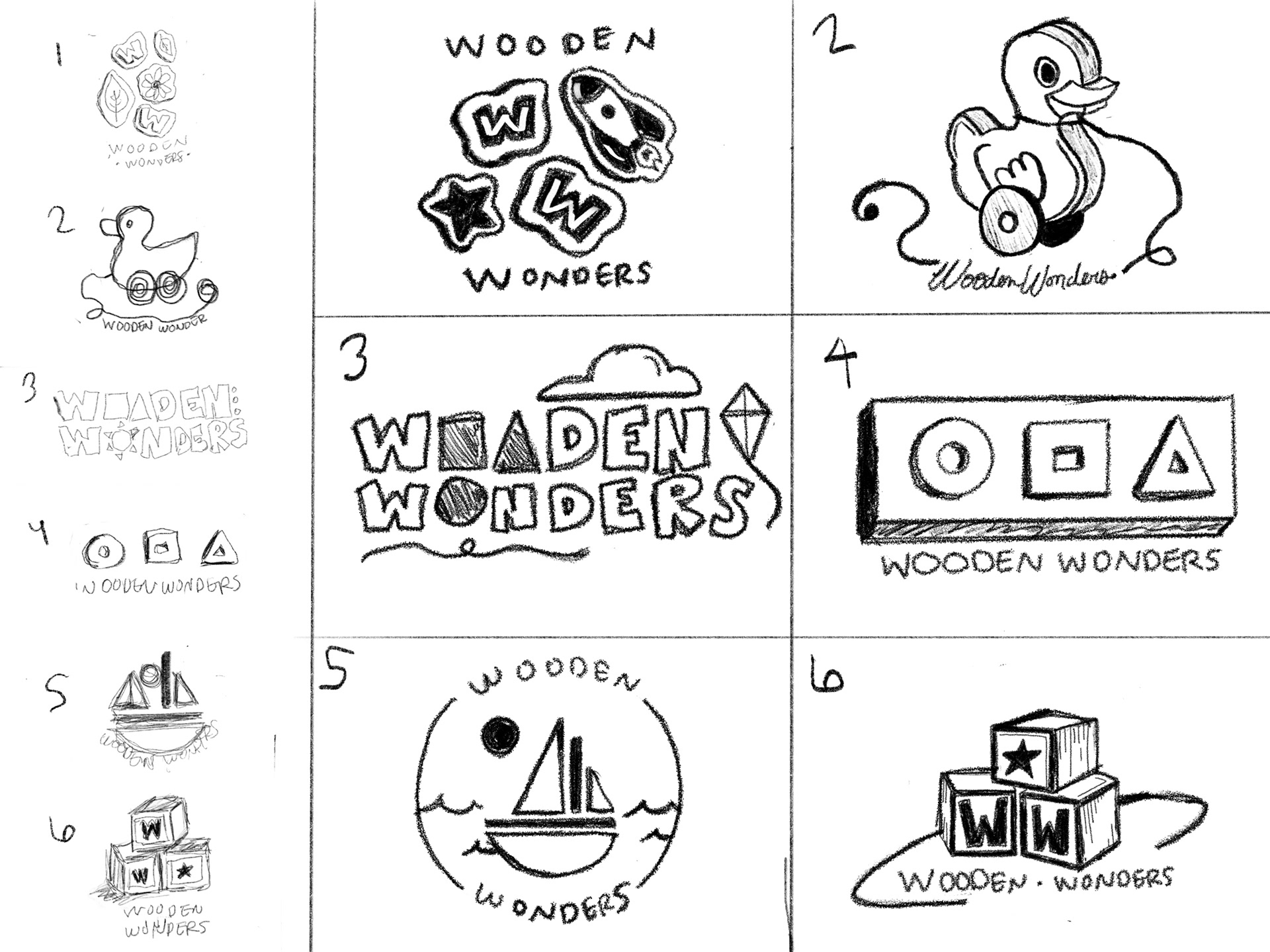
The design process began with hand-drawn explorations focusing on organic shapes, classic toy silhouettes, and tactile line work. Iterative sketching allowed for rapid testing of proportions, balance, and child-friendly typography before transitioning into vector software.



Final Logo
The final logo features a classic wooden pull-duck toy wrapped in a versatile circular emblem. Designed for maximum versatility, the primary badge pairs custom arched typography along a vector path with playful geometric color accents, capturing a nostalgic, heirloom-quality aesthetic.
The standalone duck illustration (right) serves as a secondary mark, scaling cleanly for small digital icons, packaging stamps, and product tags.


Letterhead Package
To bring the identity into tangible touchpoints, a unified letterhead package was developed, including a business card, letterhead, and matching envelope.
Print & Prepress Details: Designed with a clean grid hierarchy, consistent margins, 0.125-inch bleeds, and accurate CMYK color profiles to ensure flawless reproduction across different paper stocks.


Animated Logo Mark
Bringing the static identity to life, the logo was animated in Adobe After Effects to add personality and playfulness for digital brand touchpoints, web headers, and social media media assets.